
Idealista
Idealista
4,7
4,7
Idealista
4,7
Idealista
4,7
Idealista
4,7
Interface to take you
into your choice
Interface to take you
into your choice
UI to take you into your choice
UI to take you into your choice
Interface to take you into your choice
UX/UI Concept for home searching platform
UX/UI for home searching
UX/UI for home searching

Disclaimer
To respect confidentiality agreements, some details, metrics, and internal documentation have been simplified or omitted. The insights shared here are my own and don’t necessarily represent the views of Idealista.
Disclaimer
To respect confidentiality agreements, some details, metrics, and internal documentation have been simplified or omitted. The insights shared here are my own and don’t necessarily represent the views of Seat.
Getting started
Getting started
A digital Home searching
Idealista is a leading online real estate platform, connecting sellers, agents, and developers with people looking for their next home. Founded in 2000, it's grown into a feature-rich tool with advanced filters for location, price, size, amenities—basically everything you'd need to find the right property.
This was an exploratory redesign proposal focused on making navigation clearer and actions more intuitive—taking an already powerful platform and making it feel less overwhelming.
A digital Home searching
Idealista is a leading online real estate platform, connecting sellers, agents, and developers with people looking for their next home. Founded in 2000, it's grown into a feature-rich tool with advanced filters for location, price, size, amenities. Basically everything you'd need to find the right property.
This was an exploratory redesign proposal focused on making navigation clearer and actions more intuitive, taking an already powerful platform and making it feel less overwhelming
The problem
The problem
When more feels like too much
Looking for a home isn't just browsing. It's emotional, time-sensitive, and often stressful. You're making one of the biggest decisions of your life, and the interface shouldn't add to that pressure.
Over the years, Idealista had evolved into a powerhouse platform—capable of answering almost any real estate need. But with that growth came visual density. Filters, labels, banners, actions... everything competing for attention at once.
The goal was to propose a direction that would make navigation clearer and actions more intuitive, while respecting the platform's existing strengths.
When more feels like
too much
Looking for a home is rarely a neutral experience. It’s emotional, time-sensitive, and often overwhelming.This project started from the idea that an interface should not add pressure to an already complex decision, but help users slow down, understand, and choose with confidence.
Over time, Idealista had grown into a feature-rich platform, capable of answering almost any real-estate need. But with that growth came visual density. Filters, labels, banners, and actions were constantly competing for attention.
The goal was to propose a direction that would make navigation clearer and actions more intuitive, while respecting the platform's existing strengths.
When more feels like too much
Looking for a home is rarely a neutral experience. It’s emotional, time-sensitive, and often overwhelming.This project started from the idea that an interface should not add pressure to an already complex decision, but help users slow down, understand, and choose with confidence.
Over time, Idealista had grown into a feature-rich platform, capable of answering almost any real-estate need. But with that growth came visual density. Filters, labels, banners, and actions were constantly competing for attention.
The goal was to propose a direction that would make navigation clearer and actions more intuitive, while respecting the platform's existing strengths.
My Role
My Role
I led this exploration and presented the redesign concept to the Design Lead after two weeks of deep research and ideation. As UX/UI Designer, I owned:
UX architecture and user flows
UI design and component definition
Translating brand identity into digital patterns
I led this exploration and presented the redesign concept to the Design Lead after two weeks of deep research and ideation. As UX/UI Designer, I owned:
UX architecture and user flows
UI design and component definition
Translating brand identity into digital patterns
Research
Research
Learning from the noise
I started with a competitor benchmark—analyzing direct competitors and adjacent marketplaces like Airbnb, Zillow, and Rightmove. A pattern emerged quickly: most platforms were showing too much, too early. Information was being thrown at users before they could reasonably process it.
The insight? Most platforms were optimized for exposure, not understanding.
That reframed everything. Clarity wouldn't come from showing less, it would come from showing things at the right time.
Learning from the noise
The project began with a benchmark of direct competitors and adjacent digital marketplaces. While analyzing patterns across the market, one theme kept repeating: more information was being presented earlier than users could reasonably process.
By comparing flows side by side, it became clear that most platforms were optimized for exposure rather than understanding. This insight reframed the direction of the project — clarity would come from timing, not from reduction.
Learning from
the noise
The project began with a benchmark of direct competitors and adjacent digital marketplaces. While analyzing patterns across the market, one theme kept repeating: more information was being presented earlier than users could reasonably process.
By comparing flows side by side, it became clear that most platforms were optimized for exposure rather than understanding. This insight reframed the direction of the project — clarity would come from timing, not from reduction.


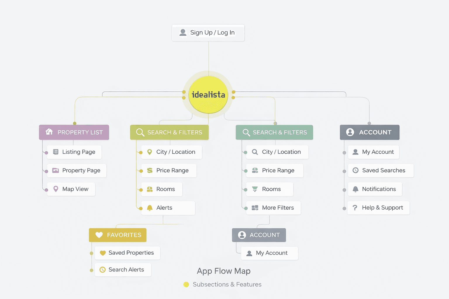
Architecture
Architecture
Structure without rigidity
Instead of rebuilding the entire system, I focused on how information unfolds through the experience.
Key decisions:
Separate exploration from decision-making — don't force users to commit before they're ready.
Progressive disclosure for filters and property details — reveal complexity only when needed.
Consistent spatial patterns — navigation should feel predictable, not puzzling.
Structure without rigidity
Instead of rebuilding the entire system, I focused on how information unfolds through the experience. Key decisions:
Separate exploration from decision-making — don't force users to commit before they're ready.
Progressive disclosure for filters and property details — reveal complexity only when needed.
Consistent spatial patterns — navigation should feel predictable, not puzzling.
Design Process
Design Process
Wireframes as storytelling
Wireframes became a tool for asking a simple question at every step: What does the user need to see right now, and what can wait?
I iterated quickly on flows and layouts, gradually moving from dense and functional to intentional and calm. Only once the structure felt balanced did I move into visual design. Each iteration was about timing and trust, trusting that users would explore deeper when they were ready, not because we forced it.
Visual Language
Visual Language
Designing clarity through restraint
The final interface was designed to feel calm, readable, and supportive — reducing friction during one of the most emotional decision-making processes: choosing a home.
Designing clarity through restraint
The final interface was designed to feel calm, readable, and supportive — reducing friction during one of the most emotional decision-making processes: choosing a home.
Colors
Colors
The palette is intentionally soft and restrained. Strong brand colors exist, but they're not aggressive.
Soft greens signal actions, progress, and confirmation
Neutral backgrounds keep focus on content and property images
Subtle accents differentiate filters and categories
Color supports decisions—it never rushes them.
The palette is intentionally soft and restrained. Strong brand colors exist, but they're not aggressive.
Soft greens signal actions, progress, and confirmation
Neutral backgrounds keep focus on content and property images
Subtle accents differentiate filters and categories
Typography
Typography
Typography does the heavy lifting when dealing with dense information. I chose a clean, modern sans-serif to ensure:
High readability across long browsing sessions
Clear hierarchy between primary info (price, location, property type) and secondary details
Neutral tone that doesn't compete with imagery
Icons
Icons
Icons are thinked to be:
Universally recognizable
Visually lightweight
Consistent in stroke, proportion, and style
They support content instead of replacing it—helping users quickly identify amenities, filters, and actions without adding visual noise.
By keeping icons minimal and neutral, the interface stays focused on what matters: the properties themselves.
Icons are thinked to be:
Universally recognizable
Visually lightweight
Consistent in stroke, proportion, and style
They support content instead of replacing it, helping users quickly identify amenities, filters, and actions without adding visual noise.
By keeping icons minimal and neutral, the interface stays focused on what matters: the properties themselves.
Icons are thinked to be:
Universally recognizable
Visually lightweight
Consistent in stroke, proportion,
and style
They support content instead of replacing it—helping users quickly identify amenities, filters, and actions without adding visual noise.
By keeping icons minimal and neutral, the interface stays focused on what matters: the properties themselves.

Layouts and Spacing
Layouts and Spacing
Spacing is used as an active design tool.
Generous padding and clear separation between sections allow users to process information step by step, rather than all at once.
Cards isolate content into individual units
Spacing is used as an active design tool.
Generous padding and clear separation between sections allow users to process information step by step, rather than all at once.
Cards isolate content into individual units
Filters are visually grouped in one screen to reduce scanning effort
Key actions remain reachable without dominating the screen
This reduces cognitive load while maintaining access to advanced options.

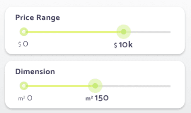
Interactions
Interactions
Interactions are designed to feel responsive but unobtrusive:
Sliders provide immediate visual feedback
Buttons are clearly shaped and consistently placed
Transitions are soft, reinforcing continuity rather than drawing attention
Every interaction reinforces the idea that the app adapts to the user, not the other way around. Smooth transitions and clear button states give users confidence in what they're doing.
Interactions are designed to feel responsive but unobtrusive:
Sliders provide immediate visual feedback
Buttons are clearly shaped and
consistently placed
Transitions are soft, reinforcing continuity rather than drawing attention
Every interaction reinforces the idea that the app adapts to the user, not the other way around. Smooth transitions and clear button states give users confidence in what they're doing.
Interactions are designed to feel responsive but unobtrusive:
Sliders provide immediate visual feedback
Buttons are clearly shaped and consistently placed
Transitions are soft, reinforcing continuity rather than drawing attention
Every interaction reinforces the idea that the app adapts to the user, not the other way around. Smooth transitions and clear button states give users confidence in what they're doing.
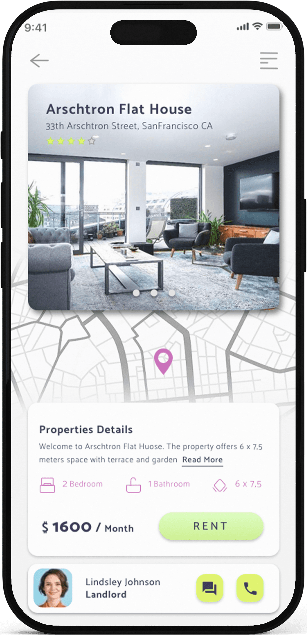
Final Design
The light mode interface uses a soft, neutral base with plenty of white space. Property images take center stage, supported by clean typography and strategic use of green accents for CTAs.
The layout follows a card-based system—each property gets its own visual container, making it easy to scan through listings without losing context. Key information (price, location, size) is prominently displayed, while additional details are accessible with a tap. Filters are grouped intelligently, reducing the need to jump between screens. Users can refine their search without losing momentum.
The overall aesthetic? Calm, confident, and focused. It feels like a tool that respects your time and supports your decision-making process.
Final Design
The light mode interface uses a soft, neutral base with plenty of white space. Property images take center stage, supported by clean typography and strategic use of green accents for CTAs.
The layout follows a card-based system, each property gets its own visual container, making it easy to scan through listings without losing context. Key information (price, location, size) is prominently displayed, while additional details are accessible with a tap. Filters are grouped intelligently, reducing the need to jump between screens. Users can refine their search without losing momentum.
The overall aesthetic? Calm, confident, and focused. It feels like a tool that respects your time and supports your decision-making process.
Final thoughts
This exploration taught me that complexity doesn't have to feel complicated. When you design with empathy for the user's mental state—especially during stressful, emotional decisions like finding a home—you can propose solutions that feel supportive rather than overwhelming.
It wasn't about removing features or simplifying for the sake of minimalism. It was about reimagining how those features are revealed—making space for clarity without sacrificing depth.
As a design proposal, it demonstrated how strategic restraint and thoughtful information architecture can transform a dense experience into something calm and confident. Sometimes the most powerful design move is knowing when to hold back.