
MySeat APP
4,4
MySeat APP
4,4
MySeat APP
4,4
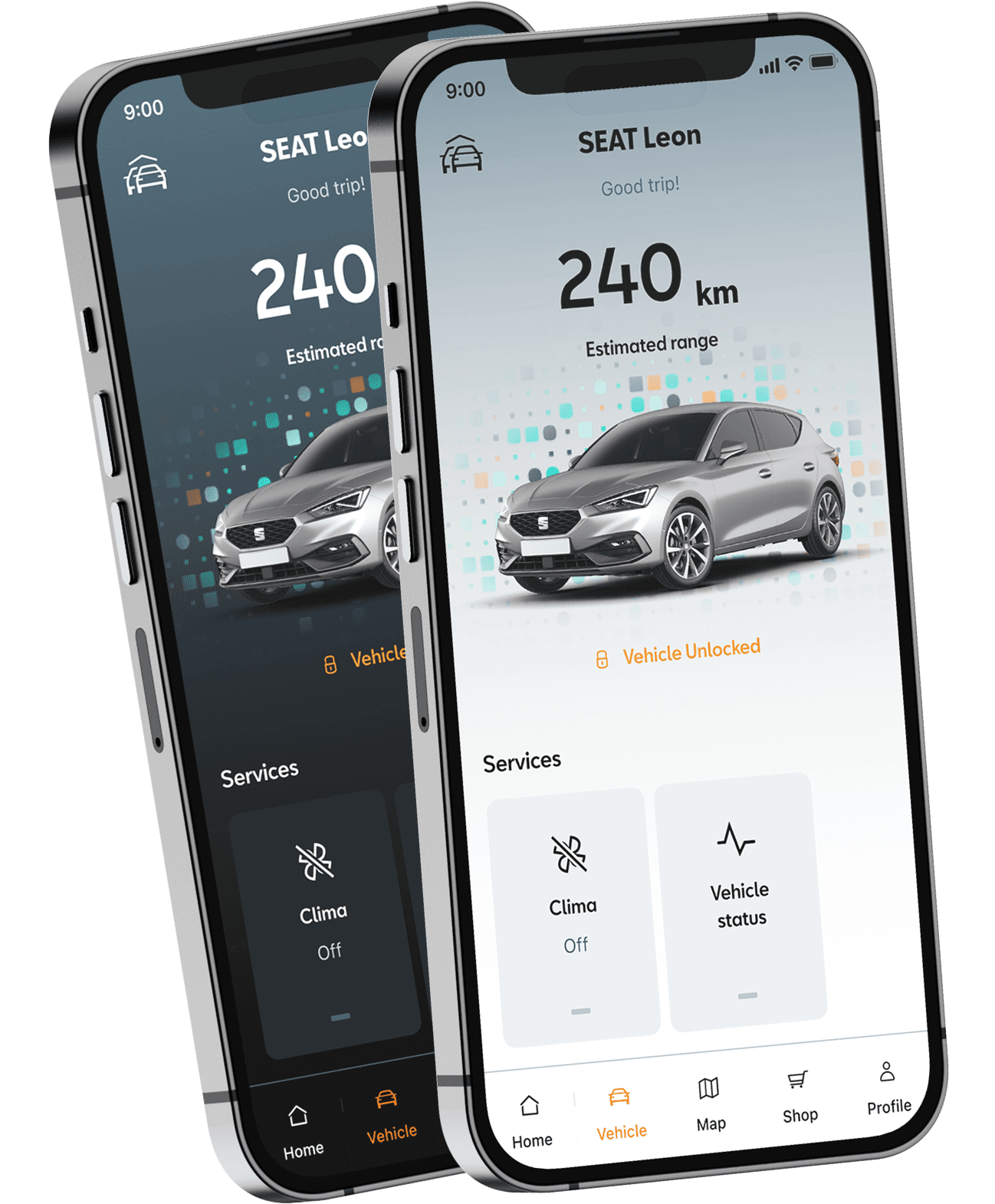
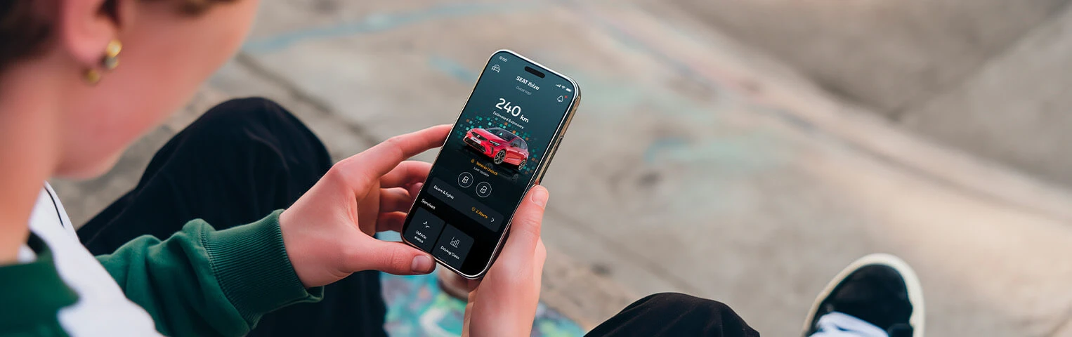
Everyday mobility,
right in your pocket
Everyday mobility, in your pocket
Everyday mobility,
right in your pocket
Everyday mobility,
right in your pocket
Everyday mobility,
right in your pocket
How UI can impact in a different brand experience
How UI can impact in a different brand experience
Disclaimer
To respect confidentiality agreements, some details, metrics, and internal documentation have been simplified or omitted. The insights shared here are my own and don’t necessarily represent the views of Seat.
Disclaimer
To respect confidentiality agreements, some details, metrics, and internal documentation have been simplified or omitted. The insights shared here are my own and don’t necessarily represent the views of Seat.
Getting started
Getting started
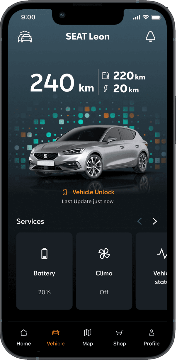
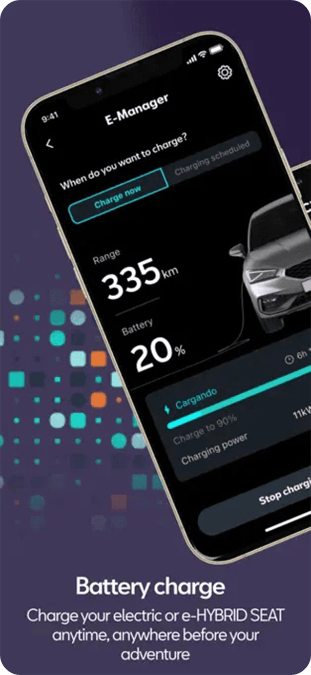
About MySeat
MySEAT is the connected car app for SEAT drivers, allowing users to interact with their vehicle remotely, check status information, manage services, and receive notifications.This project was not about creating a new product from scratch.
Instead, the challenge was to transform an existing app originally designed for CUPRA into a distinctly SEAT experience, without changing its architecture, flows, or interaction logic.
Challenge
Challenge
Change Clothes
The MyCUPRA app already had a validated UX architecture, mature interaction patterns, and a scalable design system. The challenge was basically to visually change clothes to the application with a very different personality, using visual language alone. We migrate the whole design system from Sketch to Figma and actually that was really tough!
The risk was clear:
How do you completely change the perception of a product without touching its structure?
High-level goals
High-level goals
High-level goals
1. Brand differences
Create a visual identity that clearly expresses SEAT’s approachable, everyday tone while remaining unmistakably distinct from CUPRA.
1. Brand differences
Create a visual identity that clearly expresses SEAT’s approachable, everyday tone — while remaining unmistakably distinct from CUPRA.
1. Brand differences
Create a visual identity that clearly expresses SEAT’s approachable, everyday tone — while remaining unmistakably distinct from CUPRA.
2. UX Consistency
Preserve the proven architecture and interaction patterns to avoid usability regressions and development overhead.
2. UX Consistency
Preserve the proven architecture and interaction patterns to avoid usability regressions and development overhead.
2. UX Consistency
Preserve the proven architecture and interaction patterns to avoid usability regressions and development overhead.
My Role
My Role
UX/UI Designer alongside Design Lead in a cross-functional team (Product, Engineering, Brand/Marketing).
Owned: UI design, component definition, design system migration, brand translation into digital patterns.
The Problem
The Problem
One platform, two personalities
SEAT and CUPRA share DNA but speak different languages.
CUPRA: Sharp, bold, performance-driven
SEAT: Approachable, friendly, practical
Change Clothes
The MyCUPRA app already had a validated UX architecture, mature interaction patterns, and a scalable design system. The challenge was basically to visually change clothes to the application with a very different personality, using visual language alone. We migrate the whole design system from Sketch to Figma and actually that was really tough!
The risk was clear:
How do you completely change the perception of a product without touching its structure?
Change Clothes
SEAT and CUPRA share DNA but speak different languages.
CUPRA: Sharp, bold, performance-driven
SEAT: Approachable, friendly, practical
The apps needed to reflect that difference despite sharing the same foundation.
Change Clothes
SEAT and CUPRA share DNA but speak different languages.
CUPRA: Sharp, bold, performance-driven
SEAT: Approachable, friendly, practical
The apps needed to reflect that difference despite sharing the same foundation.
Design Process
Design Process
Before making any visual changes, we deeply analyzed the MyCUPRA app component, structure, spacing rules, interaction patterns, information hierarchy.
The goal wasn't to redesign. It was to identify where brand expression could live without affecting usability.
The process followed these phases:
Before making any visual changes, we deeply analyzed the MyCUPRA app component, structure, spacing rules, interaction patterns, information hierarchy.
The goal wasn't to redesign. It was to identify where brand expression could live without affecting usability.
The process followed these phases:
Before making any visual changes, we deeply analyzed the MyCUPRA app component, structure, spacing rules, interaction patterns, information hierarchy.
The goal wasn't to redesign. It was to identify where brand expression could live without affecting usability.
The process followed these phases:
Architecture
Architecture
One structure, different look.
MySEAT uses exactly the same architecture as MyCUPRA. All screens, flows, and logic migrated from Sketch to Figma.
Benefits:
Consistent interaction patterns
Reduced design/dev effort
Faster delivery
Scalability for future updates
One structure, different look.
MySEAT uses exactly the same architecture as MyCUPRA. All screens, flows, and logic migrated from Sketch to Figma.
Benefits:
Consistent interaction patterns
Reduced design/dev effort
Faster delivery
Scalability for future updates
One structure, different look.
The MySEAT app uses exactly the same architecture as MyCUPRA.
All screens, flows, and component logic were migrated into Figma from Sketch.
This approach allowed us to:
Keep interaction patterns consistent
Reduce design and development effort
Ensure faster delivery
Maintain scalability
Research
Research
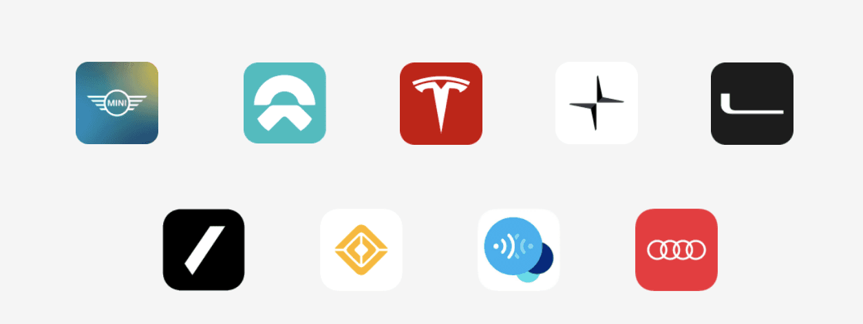
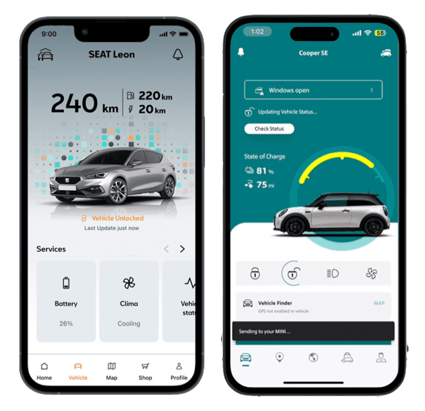
Benchmark
We focused on visual comparison and brand perception. We’ve analyzed:
MyCUPRA vs MySEAT side by side
Competitor apps (BMW, Mercedes, VW, Audi)
How visual elements influence perceived complexity
Benchmark
Rather than user interviews, research focused on visual comparison and brand perception. We analyzed:
MyCUPRA vs MySEAT side by side
Other automotive companion apps
How visual elements influence perceived complexity and accessibility.
Here's some brand that we analyzed for the benchmark.
Benchmark
Rather than user interviews, research focused on visual comparison and brand perception. We analyzed:
MyCUPRA vs MySEAT side by side
Other automotive companion apps
How visual elements influence perceived complexity and accessibility.
Here's some brand that we analyzed for the benchmark.
Customers Insights
From internal reviews and comparative analysis, a key insight emerged:
Users perceive apps as fundamentally different products, even when behavior remains the same, as long as visual language changes significantly.
This reinforced the idea that brand lives in visual decisions, not structural ones..
Market Insights
Many automotive apps attempt rebranding by changing features or navigation, often introducing friction.
This project demonstrates an alternative: transforming identity through visual expression while preserving usability.
Market Insights
Many automotive apps attempt rebranding by changing features or navigation, often introducing friction.
This project demonstrates an alternative: transforming identity through visual expression while preserving usability.

Solution
Solution
Concept
Rather than user interviews, research focused on visual comparison and brand perception. We analyzed:
MyCUPRA vs MySEAT side by side
Other automotive companion apps
How visual elements influence perceived complexity and accessibility.
Even we almost have a clear direction for the concept, we try to exploring a bit more,
aware that all changes and corrections will have to be approved from above, and this complicated process most of the time does not ensure aprovation.
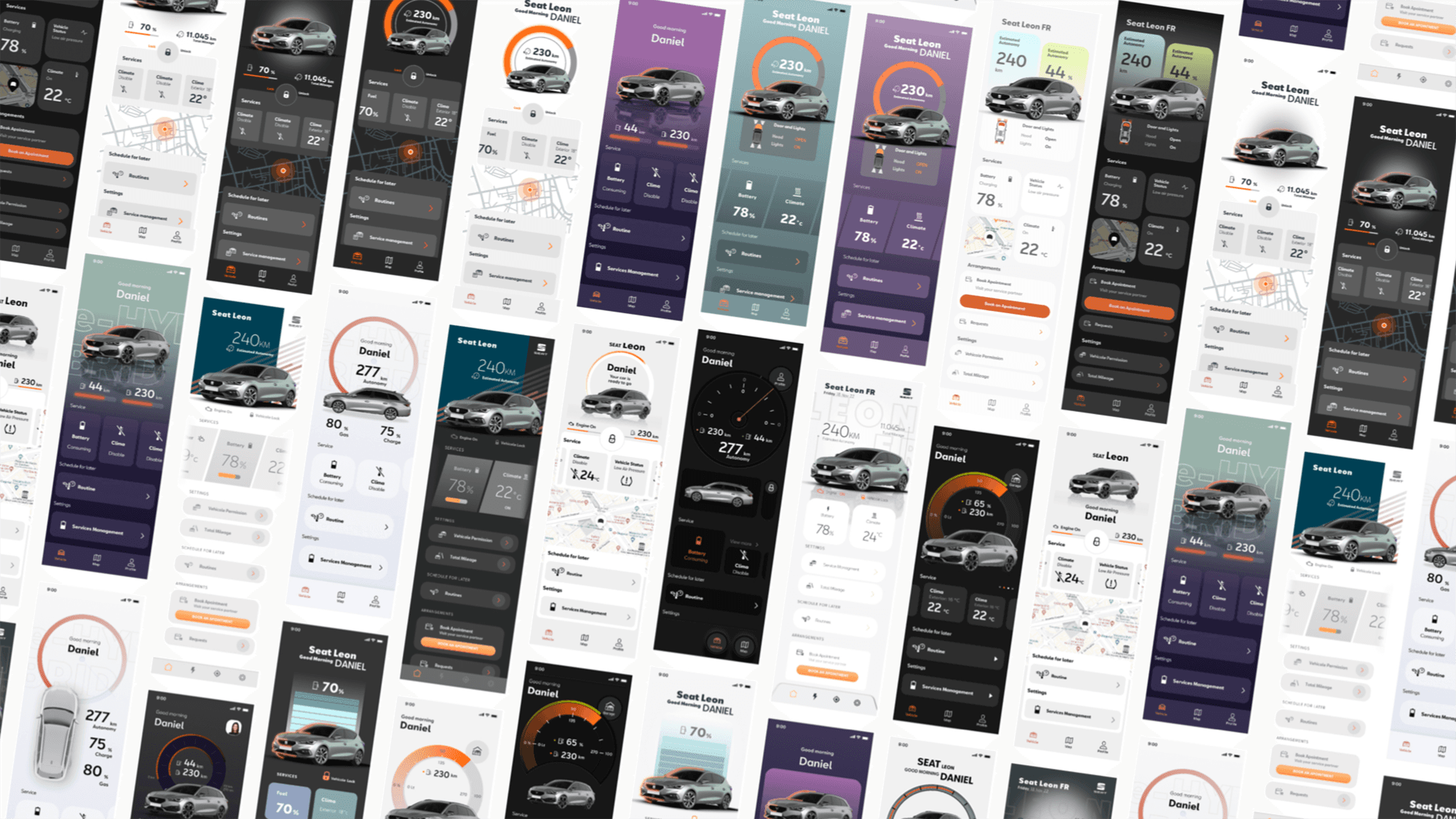
Final Design
We have merged the selected proposals, transferring the MyCupra content, according to customer feedback, proposing some fundamental elements to differentiate the brand such as:
Final Design
We have merged the selected proposals, transferring the MyCupra content, according to customer feedback, proposing some fundamental elements to differentiate the brand such as:
Final Design
We have merged the selected proposals, transferring the MyCupra content, according to customer feedback, proposing some fundamental elements to differentiate the brand such as:
1. Corner Radius
We rounded the corners to reflect a softer and less square visual approach.
1. Corner Radius
We rounded the corners to reflect a softer and less square visual approach.
1. Corner Radius
We rounded the corners to reflect a softer and less square visual approach.
2. Render 3/4
We decide to change perspective of the render as element of difference between the two app
2. Render 3/4
We decide to change perspective of the render as element of difference between the two app
2. Render 3/4
We decide to change perspective of the render as element of difference between the two app
3. Faded Background
Introducing a faded background instead of the solid color of Cupra.
3. Faded Background
Introducing a faded background instead of the solid color of Cupra.
These elements create a calmer, more familiar experience, aligned with SEAT’s everyday positioning.
3. Faded Background
Introducing a faded background instead of the solid color of Cupra.

Production
We have merged the selected proposals, transferring the MyCupra content, according to customer feedback, proposing some fundamental elements to differentiate the brand such as:
Production
We have merged the selected proposals, transferring the MyCupra content, according to customer feedback, proposing some fundamental elements to differentiate the brand such as:
Production
We have merged the selected proposals, transferring the MyCupra content, according to customer feedback, proposing some fundamental elements to differentiate the brand such as:
+100 Components
In the Design System we define organization and structure (Tokens). We create more than 100 components, documented with changelog.
+100 Components
In the Design System wedDefine organization and structure (Tokens). We create more than 100 components, documented with changelog.
+100 Components
In the Design System wedDefine organization and structure (Tokens). We create more than 100 components, documented with changelog.
+31 Delivered Features
Assemble the screens defined in the wireflow documented by updating the changelog.
+31 Features
Assemble the screens defined in the wireflow documented by updating the changelog.
+31 Delivered Features
Assemble the screens defined in the wireflow documented by updating the changelog.
Style Guide
Style Guide
Colors
The color palette reflects SEAT’s friendly and accessible tone, avoiding high contrast or aggressive accents.
Colors
The color palette reflects SEAT’s friendly and accessible tone, avoiding high contrast or aggressive accents.
Colors are used to guide attention and reinforce hierarchy rather than decorate the interface.


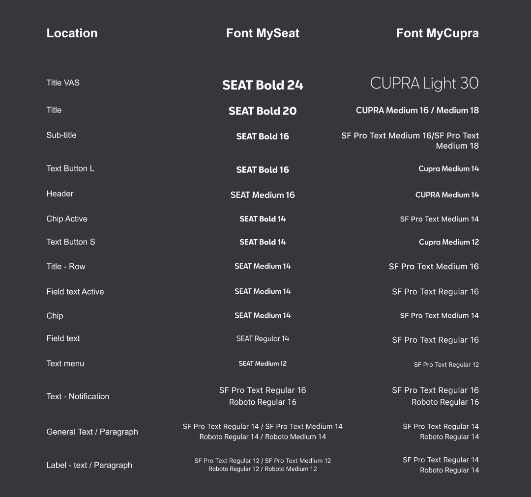
Typography
Modern but welcoming. Same hierarchy as CUPRA, lighter overall tone. We compare the twos typography to have a better overview.
Typography
The color palette reflects SEAT’s friendly and accessible tone, avoiding high contrast or aggressive accents.
Colors are used to guide attention and reinforce hierarchy rather than decorate the interface.
Validations and Metrics
Validations and Metrics
Proof in perception
Validated through internal reviews and visual comparison, not traditional testing.
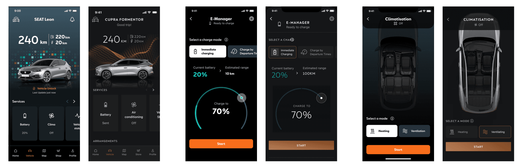
Shared rebranded interface with brand, dev, and product stakeholders. Result: new visual language fully embodied SEAT's identity while preserving MyCUPRA's validated usability. Visual comparison study: Placed MySEAT, MyCUPRA, and competitors side by side. Despite identical architecture, MySEAT communicates a noticeably different tone—more accessible, softer, everyday-oriented.
Visual evidence that brand perception lives in color, typography, spacing, and shape.
Proof in perception
Validated through internal reviews and visual comparison, not traditional testing.
Shared rebranded interface with brand, dev, and product stakeholders. Result: new visual language fully embodied SEAT's identity while preserving MyCUPRA's validated usability. Visual comparison study: Placed MySEAT, MyCUPRA, and competitors side by side. Despite identical architecture, MySEAT communicates a noticeably different tone—more accessible, softer, everyday-oriented.
Visual evidence that brand perception lives in color, typography, spacing, and shape.
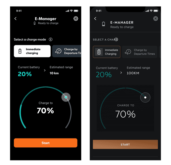
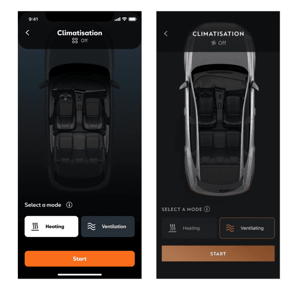
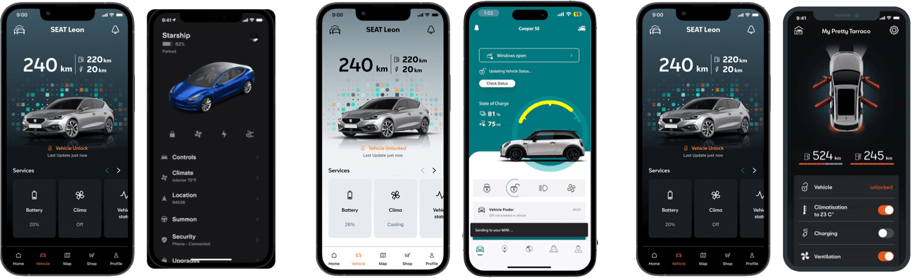
MySeat vs. MyCupra
While both apps share the same structure and interactions, their visual tone communicates two distinct brand personalities:
CUPRA emphasizes sharpness, contrast, and performance
SEAT focuses on familiarity, softness, and ease of use
Differences in color systems, typography, spacing, and corner radii create two clearly recognizable experiences, even when screens are compared side by side.

MySeat vs. Automotive brands
While both apps share the same structure and interactions, their visual tone communicates two distinct brand personalities:
Premium (BMW, Mercedes, Audi): Dark, heavy, luxury-focused
Mass market (VW, Ford, Toyota): Utilitarian, function-over-form
Performance (Alfa Romeo, Mini): Bold, playful, energetic
MySEAT: More premium than mass market, more approachable than luxury, more calm than performance.
MySeat vs. Automotive brands
While both apps share the same structure and interactions, their visual tone communicates two distinct brand personalities:
CUPRA emphasizes sharpness, contrast, and performance
SEAT focuses on familiarity, softness, and ease of use
Differences in color systems, typography, spacing, and corner radii create two clearly recognizable experiences, even when screens are compared side by side.

Final thoughts
We couldn't touch architecture. Couldn't change flows. Had to work within a very specific box. But within that box, we found room to express an entirely different brand personality, through thoughtful visual decisions and consistent application.
Design isn't always about starting from scratch. Sometimes it's about knowing what to preserve and what to transform.
Final thoughts
We couldn't touch architecture. Couldn't change flows. Had to work within a very specific box.
But within that box, we found room to express an entirely different brand personality—through thoughtful visual decisions and consistent application.
Design isn't always about starting from scratch. Sometimes it's about knowing what to preserve and what to transform.
That takes just as much craft.
Final thoughts
We couldn't touch architecture. Couldn't change flows. Had to work within a very specific box.
But within that box, we found room to express an entirely different brand personality—through thoughtful visual decisions and consistent application.
Design isn't always about starting from scratch. Sometimes it's about knowing what to preserve and what to transform.