Clarity and focus for take
care of others
Clarity for take care of others
Clarity and focus for take
care of others
Clarity and focus for take
care of others
Clarity and focus for take care of others
Digital healthcare for Doctors and patients
Digital healthcare for Doctors
and patients
Digital healthcare for Doctors
and patients

Challenge
Challenge
Too many systems, and friction
Doctors don’t struggle with a lack of tools but they can struggle with something not so intuitive. Appointments, patient messages, prescriptions, and health data are often spread across multiple systems, forcing doctors to constantly switch context during the day.
This concept project explores how a single, coherent product could support doctors in managing patients more effectively, without adding complexity.
The goal was to design an experience that feels reliable, fast, and calm, even when the information behind it is complex.
Too many systems,
and friction
Doctors don’t struggle with a lack of tools but they can struggle with something not so intuitive. Appointments, patient messages, prescriptions, and health data are often spread across multiple systems, forcing doctors to constantly switch context during the day.
This concept project explores how a single, coherent product could support doctors in managing patients more effectively, without adding complexity.
The goal was to design an experience that feels reliable, fast, and calm — even when the information behind it is complex.
Too many systems,
and friction
Doctors don’t struggle with a lack of tools but they can struggle with something not so intuitive. Appointments, patient messages, prescriptions, and health data are often spread across multiple systems, forcing doctors to constantly switch context during the day.
This concept project explores how a single, coherent product could support doctors in managing patients more effectively, without adding complexity.
The goal was to design an experience that feels reliable, fast, and calm, even when the information behind it is complex.
Research
Research
Different tools, common issues
The project started with an in-depth research and benchmarking phase about:
Different uses, different focus
The project started with an in-depth research and benchmarking phase about:
Different uses,
different focus
The project started with an in-depth research and benchmarking phase about:
Medical App
Medical App
Medical App
Scheduling App
Scheduling App
Scheduling App
Schedule App
Health App
Health App
Health App
Health App
Key insight: Every app we analyzed focused on ONE core tool as primary. None successfully integrated multiple workflows seamlessly. We mapped essential actions for our app:
Manage appointments with calendar (alarms, notifications)
Keep critical patient information accessible
Monitor external medical devices
Pattern across competitors: Clear interfaces, strong hierarchy, simple workflows. But missing: true integration and calm, empathetic design.
Our approach:
UX: Solid, simple structure to reduce steps and friction
UI: Reduce cognitive load, surface only what matters, design for speed without sacrificing clarity
Key insight: Every app we analyzed focused on ONE core tool as primary. None successfully integrated multiple workflows seamlessly. We mapped essential actions for our app:
Manage appointments with calendar (alarms, notifications)
Keep critical patient information accessible
Monitor external medical device
Pattern across competitors: Clear interfaces, strong hierarchy, simple workflows. But missing: true integration and calm, empathetic design.
Our approach:
UX: Solid, simple structure to reduce steps and friction
UI: Reduce cognitive load, surface only what matters, design for speed without sacrificing clarity
Key insight: Every app we analyzed focused on ONE core tool as primary. None successfully integrated multiple workflows seamlessly. We mapped essential actions for our app:
Manage appointments with calendar (alarms, notifications)
Keep critical patient information accessible
Monitor external medical devices
Pattern across competitors: Clear interfaces, strong hierarchy, simple workflows. But missing: true integration and calm, empathetic design.
Our approach:
UX: Solid, simple structure to reduce steps and friction
UI: Reduce cognitive load, surface only what matters, design for speed without sacrificing clarity
Architecture
Architecture
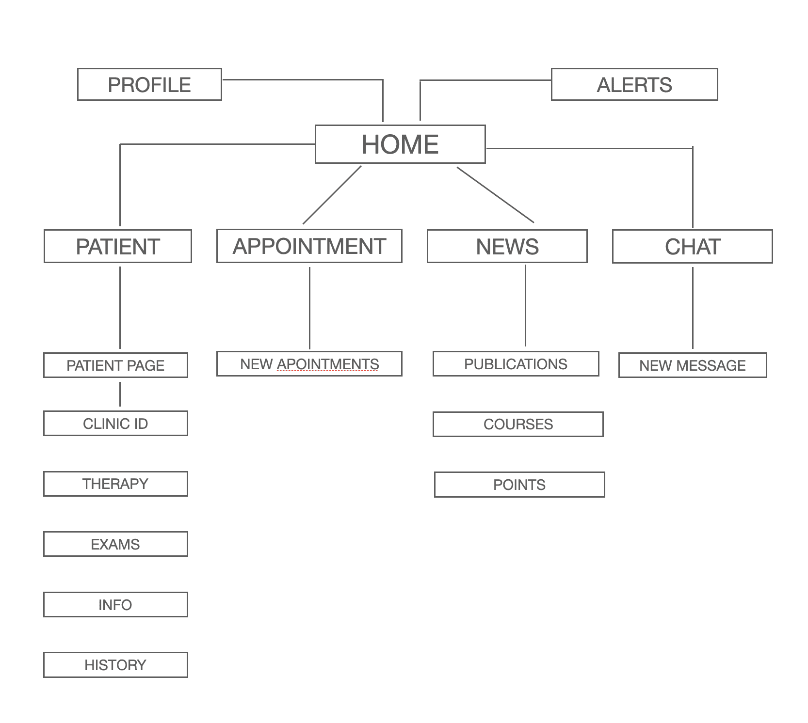
Fewer screens, smoother Flow
Based on research insights, we designed a solid information architecture structured around real daily workflows.
The app is organized into a few clear screens:
Home
Appointments
Patients
Messages
Monitoring
This architecture allows doctors to move naturally between tasks, minimizing friction and unnecessary steps.
Fewer screens,
smoother Flow
Based on research insights, we designed a solid information architecture structured around real daily workflows.
The app is organized into a few clear screens:
Home
Appointments
Patients
Messages
Monitoring
This architecture allows doctors to move naturally between tasks, minimizing friction and unnecessary steps.
Concept
Concept
Structure before style
Before high-fidelity design, I focused heavily on concept work through sketches and low-fi wireframes.
Information density and visual hierarchy
Navigation patterns and interaction logic
How to surface critical data without overwhelming
Card-based layouts for modular, scalable design
Intentionally iterative—refining flows, testing assumptions, simplifying screens before introducing visual styling.
Structure bf style
Before high-fidelity design, I focused heavily on concept work through sketches and low-fi wireframes.
Information density and visual hierarchy
Navigation patterns and interaction logic
How to surface critical data without overwhelming
Card-based layouts for modular, scalable design
Intentionally iterative—refining flows, testing assumptions, simplifying screens before introducing visual styling.
Structure before style
Before high-fidelity design, I focused heavily on concept work through sketches and low-fi wireframes.
Information density and visual hierarchy
Navigation patterns and interaction logic
How to surface critical data without overwhelming
Card-based layouts for modular, scalable design
Intentionally iterative—refining flows, testing assumptions, simplifying screens before introducing visual styling.
Sketches and Wireframes
Sketches and Wireframes
Colors
Colors
The color system was designed to support focus and emotional balance in a medical context.
The palette favors soft neutrals combined with restrained accent colors. This approach helps reduce visual stress during long usage sessions while maintaining a professional and trustworthy atmosphere.
Primary colors are used to establish structure and hierarchy, guiding attention without overpowering the content. Accent tones are introduced sparingly to communicate status, actions, and health-related signals, ensuring that important information stands out clearly when needed.
Layouts and Spacing
Layouts and Spacing
Once the structure was validated, I translated the concept into a refined UI system.
The visual language balances medical credibility with a human and approachable tone:
We use soft shapes and rounded components to reduce visual stress, a clear typography for fast scanning and decision-making. We use color accents to notify status, alerts, and actions. Components are designed to scale across the product (eventually tablet/desk)
Once the structure was validated, I translated the concept into a refined UI system. The visual language balances medical credibility with a human and approachable tone:
We use soft shapes and rounded components to reduce visual stress, a clear typography for fast scanning and decision-making. Color accents to notify status, alerts, and actions.
Components are designed to scale across the product (eventually tablet/desk)
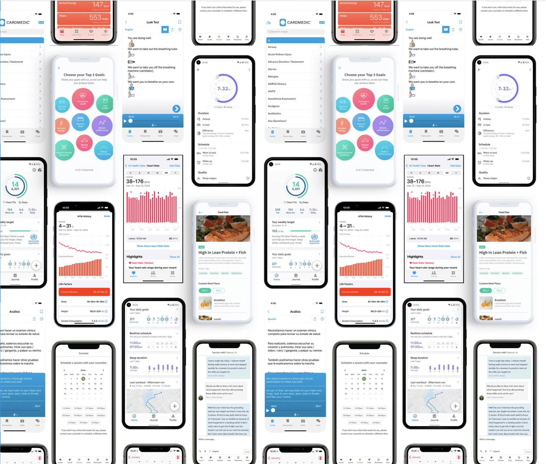
Final Design
The final concept demonstrates how a carefully structured interface can handle complex information without feeling overwhelming. Each screen is designed to support focus and confidence, reinforcing a sense of control and clarity.
Layouts are built with selectable cards to be easy to scan, allowing users to understand where to look and what to do without friction. Accents colors subtle the warnings but the color usage is restricted to be less aggressive.
Modular components work together to create an environment that feels calm, intentional, and reliable (even when dealing with dense medical content).
Each screen is designed to support focus and confidence, reinforcing a sense of control and clarity.
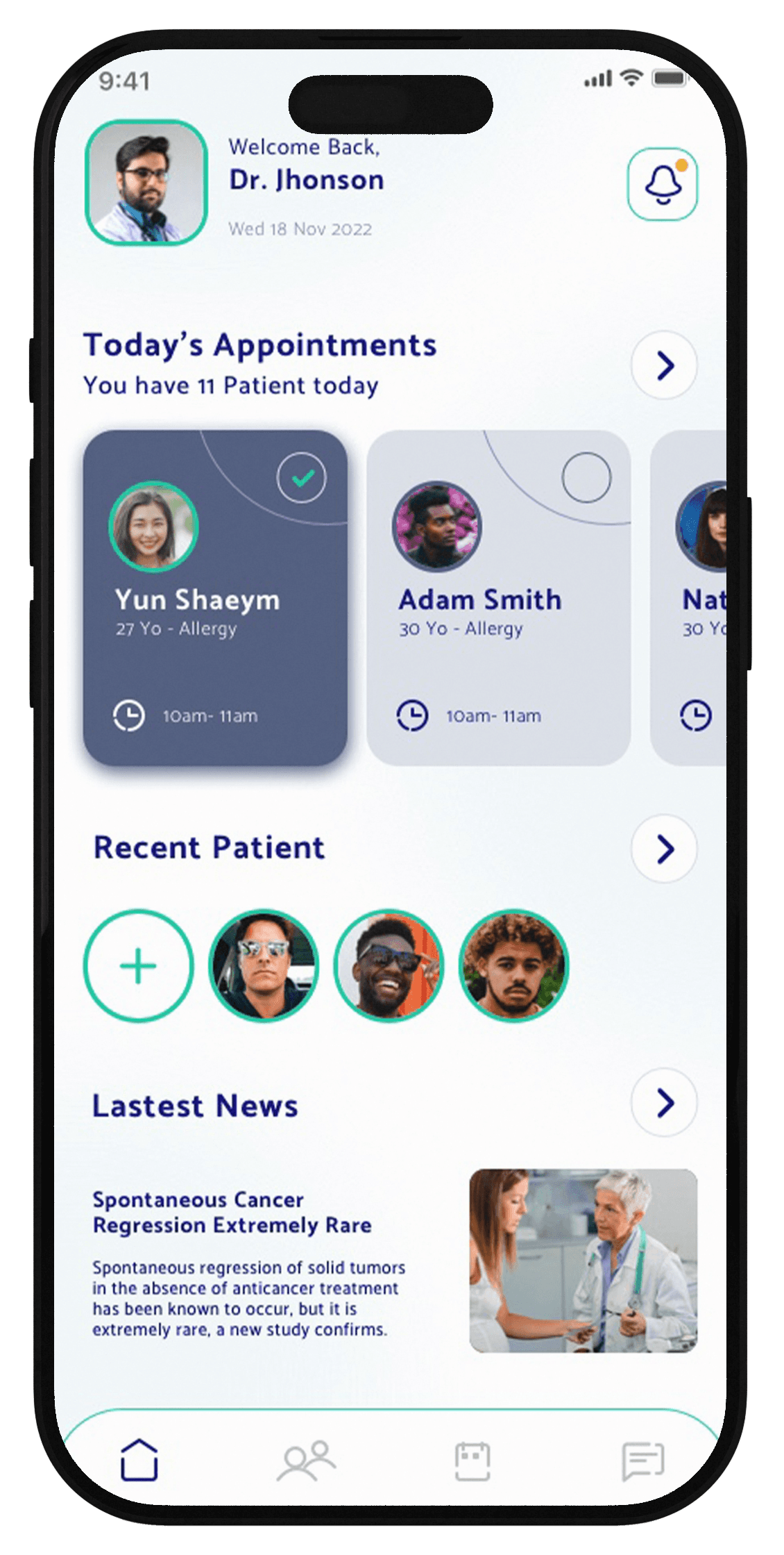
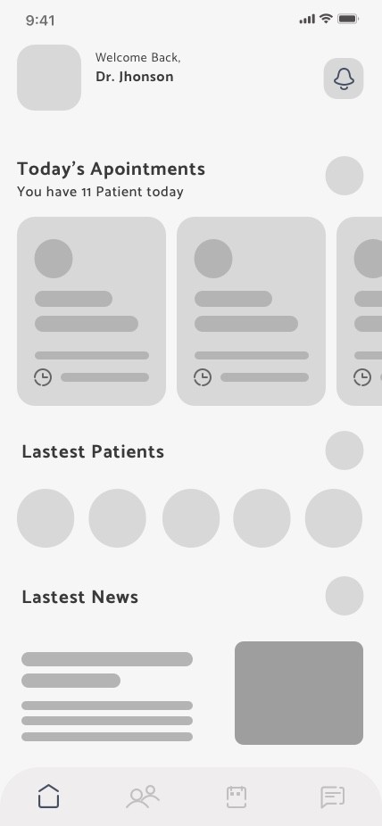
Home Screen
The Home screen is designed to ground the doctor at the beginning of each session. Instead of presenting dense medical data, the interface highlights what matters most in the moment: today’s appointments, recent patients, and relevant updates. The visual hierarchy guides attention naturally, helping doctors orient themselves quickly before moving into action. Soft surfaces, generous spacing, and rounded components reduce cognitive load and support a sense of trust and control in a clinical environment.
The Home screen is designed to ground the doctor at the beginning of each session. Instead of presenting dense medical data, the interface highlights what matters most in the moment: today’s appointments, recent patients, and relevant updates. The visual hierarchy guides attention naturally, helping doctors orient themselves quickly before moving into action. Soft surfaces, generous spacing, and rounded components reduce cognitive load and support a sense of trust and control in a clinical environment.
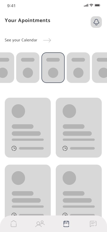
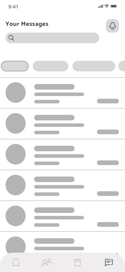
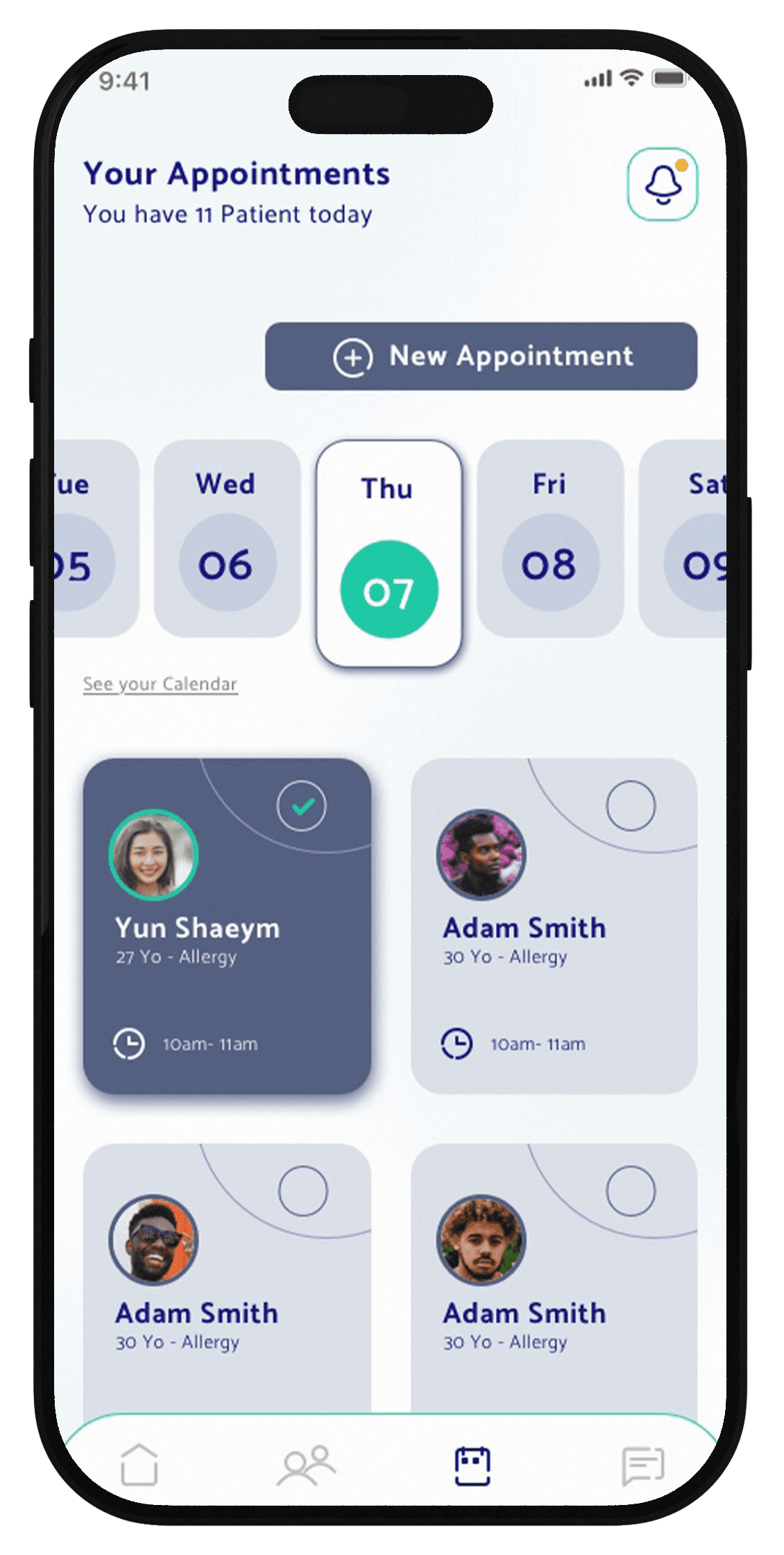
Appointments
Managing a full day of patients requires speed and clarity. The Appointments screen transforms a complex schedule into a scannable overview, allowing doctors to move effortlessly across days while keeping key information visible at a glance.
Calendar is in horizontal way scroll in the layouts but we want to make acces to the full calendar for a more clear view.
Appointment cards are selectable, emphasize patient identity, timing, medical context, enabling fast decisions without opening every detail.
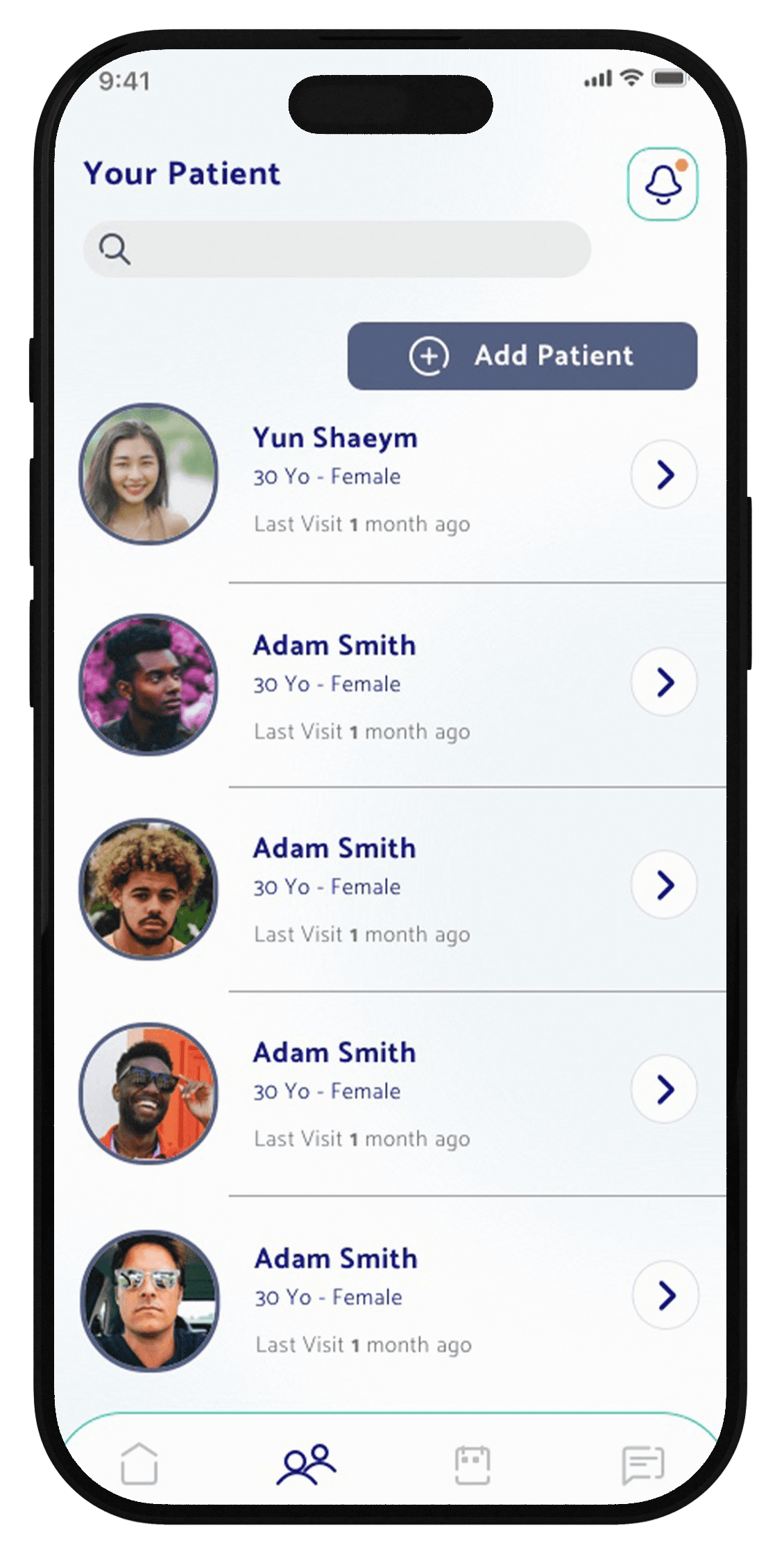
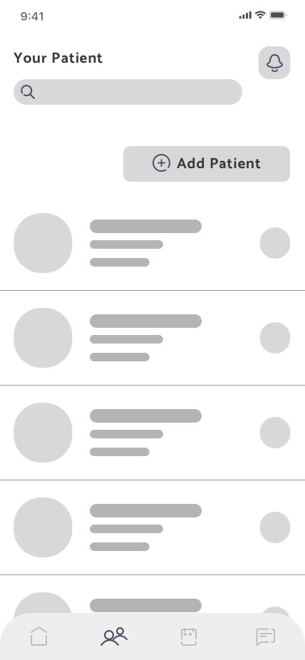
Patient
The Your Patients screen is the list of all the doctor's patients .The interface was think to be more clear as possible : a simple list with a search and filter on top.
The list provide essential info as complete name , gender, age and last visit with the doctor.
The primary actions is Add Patient with a CTA button.
An arrow take the user to the patient card where there are the monitoring actions
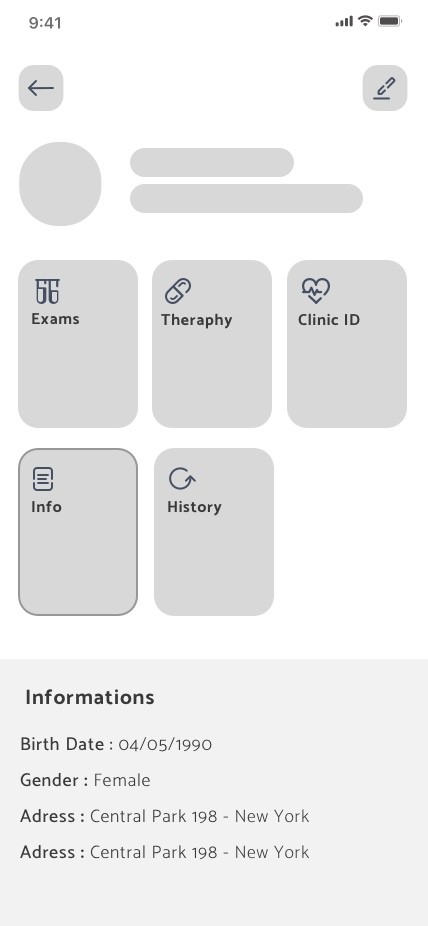
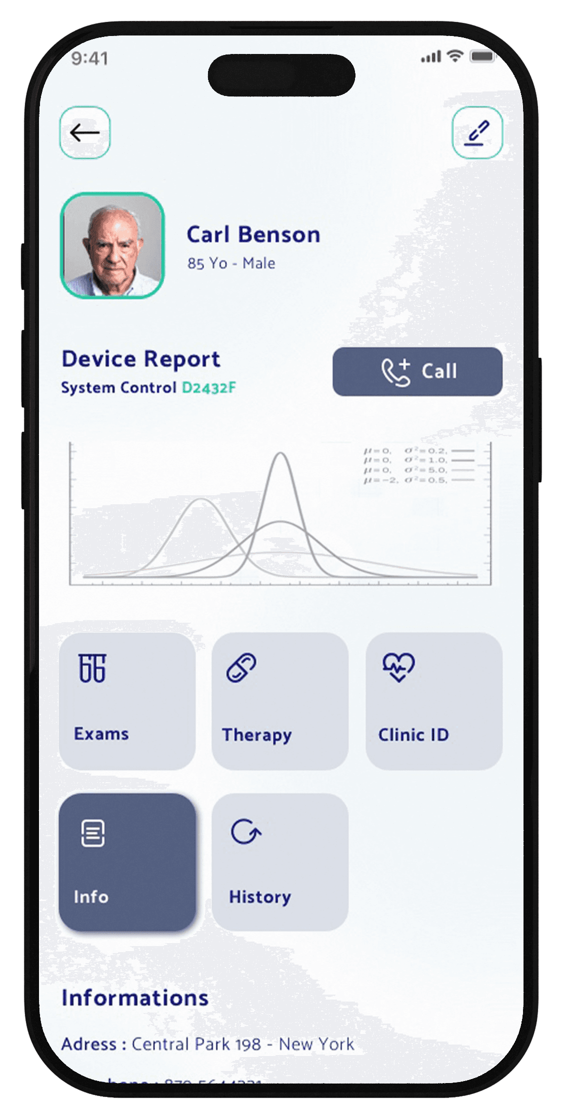
Patient Card
Patient Card provide essential medical info as Exams, Theraphy, Clinic ID and chronology.
Each info is accessible from the card button (bigger button for elder people) that open the scrolling down.
All the info are editable from the edit button on top of the screen
The graphics report the status of the patient device highlighting warning and emergencies . We decide to put a call button to have a direct phone link to the patient
Impact
Although this is a concept project, every decision is grounded in research, benchmarking, and realistic constraints.
In healthcare, simplicity isn't minimalism—it's intentional reduction
Reliable structure matters more than clever features
Design is responsibility—especially in medical contexts
The takeaway: The best interface often quietly disappears, letting doctors focus on what truly matters—their patients.
Final Thoughts
This project reinforced that healthcare design is about responsibility.
Doctors work in high-stakes, high-pressure environments. The interface shouldn't add to that stress—it should support them, quietly and reliably.
Sometimes the most impactful design work isn't flashy or bold. It's calm, clear, and gets out of the way.
That's what good healthcare design looks like.